Creating Stunning Prints: Procreate To Print Mastery
Welcome, digital artisans and canvas alchemists, to the symphonic journey of transforming your Procreate masterpieces into tangible prints that whisper tales of your artistic sojourn. Fierce colors, captivating lines, and expressive textures that once danced across your iPad’s glass canvas now beckon to leap into the physical realm, longing to grace walls and galleries with their presence. In this elaborate guide, we shall unfurl the secrets of Procreate to print – a meticulous process that ensures your digital brushstrokes crystallize into prints of unparalleled beauty and clarity.
Key Points:
- Understanding canvas size and resolution is crucial for preparing Procreate artwork for print.
- Selecting the right color profile, such as RGB to CMYK conversion, is essential for accurate color reproduction in prints.
- Working in layers in Procreate allows for non-destructive editing and an organized workflow, ensuring a smooth transition to print.
- Choosing the correct file format, such as JPEG or PNG, and exporting with the right settings are important for high-quality prints.
- Fine-tuning colors and managing details and textures are advanced tips for achieving print accuracy.
- Test printing and troubleshooting common printing issues, such as color mismatch and resolution problems, are vital for achieving print perfection.
Embark on this enlightening path, from the soft glow of your device to the crisp reality of print, where every pixel is a note in a visual symphony. Here, we will venture through the sacred groves of resolution to the formidable mountains of color profiles, ensuring that your artwork is not merely printed, but reborn with the same vigor and depth it possessed in your creative oasis. As you hold the reins of Procreate’s powerful tools, fear not, for each subtle nuance and bold stroke you rendered digitally will be mirrored in the prints that bear your signature.
Let us begin a transformation, a passage from pixels to prints, with your creative vision lighting the way. Together, we will traverse the labyrinth of technical details with ease and precision, transforming challenge into triumph. This venture is not just about art, it is about legacy, the indelible mark of your personal story etched onto medium – a siren call for Procreate enthusiasts to heed, soaring from canvas to keepsake.
Preparing Your Procreate Artwork for Print
As you approach the threshold where digital artistry meets physical manifestation, preparing your Procreate artwork for print is a sacred rite that demands finesse and attention to detail. Every brushstroke, every layer, and every hue harbors the potential to make hearts flutter when transitioned from screen to print. The pilgrimage from vibrant pixels to exquisite prints necessitates an intimate knowledge of the alchemy involved in this artful transformation. Let us unravel the tapestry of technicalities that will escort your digital masterpiece to its printed destiny with the majesty it truly deserves.
Understanding Canvas Size and Resolution
Think of the canvas size and resolution as the foundational backbone of your artwork’s destiny – an unfaltering grid upon which your digital dreams are meticulously etched. In the realm of Procreate to print, grasping this concept is akin to a sculptor understanding their marble; it determines the limitless bounds your artwork can extend to and its eventual clarity.
- Canvas Size: A vast landscape where your imagination roams free, navigating between inches and pixels to find the perfect expanse your artwork will call home. Remember, bigger canvas sizes offer room for grand statements but demand higher resolution for print perfection.
- Resolution: The beating heart of print quality, measured in dots per inch (DPI). The higher the DPI, the more detailed your prints will emerge, with 300 DPI being the sacred grail for immaculate prints that boast crystal-clear details.
In short, the marriage of the appropriate canvas size with an immaculate resolution will ensure that when your artwork whispers its transition from Procreate to the printed form, it is the purest echo of your original vision.
Understanding the marriage of appropriate canvas size and immaculate resolution is crucial for ensuring your artwork transitions from Procreate to the printed form as a pure echo of your original vision.
Selecting the Right Color Profile for Printing
Embarking on the Procreate-to-print odyssey, selecting the right color profile is akin to choosing the perfect spices for a gourmet dish – it can make or break the viewer’s experience.
- Color Profile: Imagine it as a loyal interpreter, translating the vibrant hues of your Procreate canvas to a language that the physical print can proudly replicate. The RGB color space, radiating like the sun on your digital screen, must often transmute into the CMYK spectrum – the stalwarts of print.
- CMYK Conversion: To ensure the transition is seamless, embark on the ritual of converting your digital RGB masterpiece into the CMYK realm within Procreate. This act ensures the fidelity and vibrancy of colors that the paper absorbs, ensuring that your prints sing with the same hues and emotions envisioned in your digital atelier.
By giving heed to the translation of color profiles, you arm your artwork with the essence it needs to stand tall and resplendent in the world of physical prints, a true reflection of your Procreate endeavors.
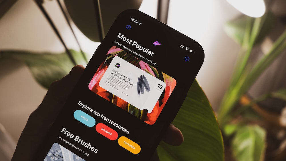
The Importance of Working in Layers
In the labyrinthine bazaar of digital artistry, layers are the magic carpets upon which your creativity soars – ethereal and mighty. In the context of Procreate to print, layers grant you the wizardry of flexibility, allowing intricate edits and adjustments to be woven without disturbing the delicate tapestry of work beneath.
- Non-Destructive Editing: By segregating elements into layers, Procreate empowers your process with the ability to tweak, refine, and perfect each aspect of your digital opus – all without the peril of corrupting the original vision.
- Organized Workflow: Assigning each stroke, texture, and tint its own layer is like curating a choir – each voice shines individually, yet in harmony, they amplify the grandeur of your art. This orderliness paves the path for a smoother transition to prints, where precisely the right notes are struck to resound in the physical realm.
Layers in digital artistry act as magic carpets, granting flexibility, non-destructive editing, and an organized workflow, allowing for intricate adjustments without disturbing the original vision.
Step-by-Step Guide to Exporting Your Artwork
The rhythm of the Procreate-to-print process crescendos as we approach the crucial concerto of exporting. With a symphony of correct file formats harmonizing with the calibrated settings, your artwork stands poised to translate its digital splendor onto the enduring canvas of print. As we unfurl the scroll of exporting, let each meticulous step be a note in this melody, guiding you towards a crescendo of printed mastery.
Choosing the Correct File Format for Your Needs
In the grand gallery of Procreate to print, the selection of file format is your golden key to unlock the doors of versatility and quality. Let us delve into the chest of formats with an artist’s discernment:
- JPEG: The ever-popular troubadour, straddling the line between high-quality and manageable file size, perfect for prints where vibrancy and simplicity waltz together.
- PNG: With its transparent background, the PNG is the illusionist of formats, letting your artwork merge with myriad surfaces, whispering hints of texture and depth.
The art of choosing leans heavily on the purpose of your print – behold the landscape of your creative vision and select the format that most honors your Procreate genesis.
Exporting Your Artwork with the Right Settings
Ensuring that the soul of your Procreate artwork is incarnated within the prints requires an alchemic blend of the right settings.
- Export Quality: Dissect your artwork with surgical precision, safeguarding its resplendence with the highest quality settings, where no pixel is left behind.
- File Integrity: Infuse the process with the elixir of preservation, utilizing Procreate features that maintain layer integrity and colors as they voyage from digital harbors to the terrestrial realm of print.
- Sharing Your Vision: The act of exporting is your magnum opus, a majesty that should be undertaken with care. Consider sharing your settings with the printing maestro, ensuring the artwork emerges as a joint testament to your shared commitment to artistic excellence.
Advanced Tips for Print Perfection
Beyond the basics lies the enchanted land of advanced tips, a realm where your Procreate artwork dons its most exquisite attire for the print ball. In this chamber of secrets, finer points of craft await – the wizardry behind print perfection – ready to elevate your canvas from marvellous to transcendent.
Fine-Tuning Colors for Print Accuracy
In the alchemy of painting with pixels, colors hold the essence of emotion, and their exact translation to print can be tantalizingly nuanced.
- Color Proofing: Like a skilled jeweler faceting a gem, employ the art of color proofing within Procreate, adjusting and tweaking hues so they shimmer equally in both the digital and printed realms.
- Print Proofs: Consider these early prints as sacred scrolls, revealing the truths of color translation and offering a canvas for further refinement. Only when the print echoes the vibrancy of your original vision, does it merit the signature of your name.
Managing Details and Textures for Print
Finding the bridge that allows every fine line, every whisper of texture in your Procreate masterpiece to tread from digital to print can be likened to capturing moonlight in your palms – fleeting yet undeniably magical.
- Zoom In: With the eagle’s eye view, scrutinize your artwork at maximum zoom in Procreate, ensuring that every detail is honed to survive the journey to print – sharp, clear, and true.
- Texture Preservation: Grasp the Procreate tools designed for texture; let them caress your prints with the same depth they do your screen. By refining textures, your prints will possess a tactile aura, allowing fingers to trace the path of your creative odyssey.
In melding these considerations with your Procreate prowess, your prints will not simply display your art – they will breathe its very essence. Thus concludes our sacrament of creation, from Procreate to the realm of physical prints, where each piece not only narrates your story but does so with a voice as clear and resonant as when you first dreamt it into being.
Zoom In: With the eagle’s eye view, scrutinize your artwork at maximum zoom in Procreate, ensuring that every detail is honed to survive the journey to print – sharp, clear, and true.
Test Printing: The Key to Success
A poet would hardly pen their verses onto a sky, unless they desired the clouds to be their critique. Similarly, a digital artist’s first print should never be their final piece. As in any great act of creation, test printing plays the starring role in the journey from Procreate to print. In this digital rehearsal, hues converse with the paper, revealing insights that the screen could never whisper.
To ensure the print quality images your heart envisages, conduct a ballet of trial with your printer – a dance that fine-tunes color balance, sharpness, and contrast before the grand performance. Let your test prints be an orchestra of color calibration, and with each iteration, adjust your artwork. Soon, your digital canvas will mirror the splendor that graces the tangible one.
Troubleshooting Common Printing Issues
Our journey through the digital bramble into the open fields of print can sometimes find us entangled in a few thorny issues. From the mischievous mismatch of colors taunting us from screen to print, to the elusiveness of clarity and detail, the artist’s path is fraught with challenges. Fear not, for we shall arm ourselves with knowledge, and like a skilled digital knight, conquer each bothersome beast that dares challenge our quest for print perfection.
Addressing Color Mismatch Between Screen and Print
The passage from a Procreate to print masterpiece can sometimes be marred by a mischievous gremlin – the color mismatch. Bold crimsons may retreat into timid roses, while lush emeralds might emerge as faded olives. This chameleon-like trickery is often the result of differences in how devices interpret color. Addressing this starts with calibrating your monitor, ensuring that what you see is as close to print reality as earthly possible.
In the mosaic of Procreate, sifting through the RGB spectrum is like painting with light, while print involves a palette of inks. Hence, convert your digital magnum opus to CMYK for a more accurate preview of the final print. Finally, consider soft proofing with your printer’s profiles to peer into the future of your artwork – ensuring the colors you’ve chosen don’t lose their voice when translated to the medium of print.
Solving Resolution and Clarity Problems
When embarking on the Procreate to print voyage, seeing our creations lose their clarity is like watching a slowly setting sun dim the vibrancy of a landscape. The culprit? Often, it’s insufficient resolution. DPI, or dots per inch, is the maestro of clarity. If it sings too softly – in other words, if the number is too low – the image appears as though through a mist.
To thwart this plight, begin with a bountiful DPI setting, typically around 300 or higher, to capture the inherent sharpness of your dreamscape. When zoomed in, your work should showcase a tapestry of pixels so fine, like grains of sand on an artist’s canvass beach. This level of detail ensures that upon print, the minutiae of your vision remain as crisp as an autumn morning.
Insufficient resolution due to low DPI can diminish the clarity of your digital creations, so begin with a DPI setting of around 300 or higher to capture the inherent sharpness of your artwork.
Dealing with File Size and Compression
Our canvas within Procreate is laden with imagination, yet when we bid our art adieu and send it forth into the world of print, we must do so wisely. Hefty file sizes can morph into burdensome beasts, sluggish and unwieldy, while ruthless compression may strip away the nuance of our brushstrokes. Balancing between large prints and practical file sizes is akin to a funambulist delicately traversing her wire.
One may consider the JPEG format for its balance of quality and compression, using settings that favor high fidelity while avoiding overly aggressive data squeezing. Alternatively, the TIFF format is like a historic archive, preserving every precious detail for posterity, albeit at the cost of digital bulk. Optimize layers, amalgamating where possible, and be mindful that each blend mode, filter, and texture adds weight to your file, just as each word adds meaning to a verse.
FAQs
1. What DPI should I use for high-quality prints?
For high-quality prints, a DPI of 300 or higher is recommended. High DPI ensures that print quality images exhibit both the depth and detail that your artwork deserves.
2. How do I convert Procreate colors from RGB to CMYK?
To convert Procreate colors from RGB to CMYK, export your artwork as a PSD file and then utilize software such as Adobe Photoshop to make the conversion, preparing your art for the printing process.
3. Can I print large-scale artwork from Procreate?
Yes, you can print large-scale artwork from Procreate. Start with a high-resolution canvas and scale up using increments to retain quality, ensuring the end result stays true to your original vision.
4. What are the best file formats for printing from Procreate?
The best file formats for printing from Procreate are PSD, PDF, JPEG with minimal compression, and TIFF. These formats offer a balance between quality and file size, catering to different printing needs.
Conclusion
Our tapestry is complete, woven with threads of wisdom from the heart of digital creation to the final print that graces the observer’s space. We ventured together from Procreate to print, elevating our artworks from mere pixels to palpable pieces that speak to the soul. Let the journey be a celebration – each test print, adjustment, and troubleshooting step a testament to the unyielding spirit of creation that thrives within us all.
In the world of art, there is no greater joy than seeing your vision come to life. By embracing these practices, we not only preserve the integrity of our work but also elevate the standard of print quality images. Cherish each pixel, each layer, and each color, for they are the essence of your expression, the silent poetry that will soon resonate in someone’s daily life.
As the curtain falls upon our shared story, may your path be adorned with creations that resonate, prints that inspire, and a digital palette that never ceases to amaze. Farewell, dear artists, until we brush paths again in the wondrous realm of creativity. With a painter’s flourish – and a heart brimming with gratitude –
Lilly-Mai.
Share with your Friends:


